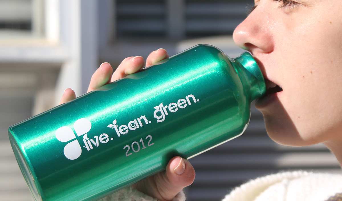
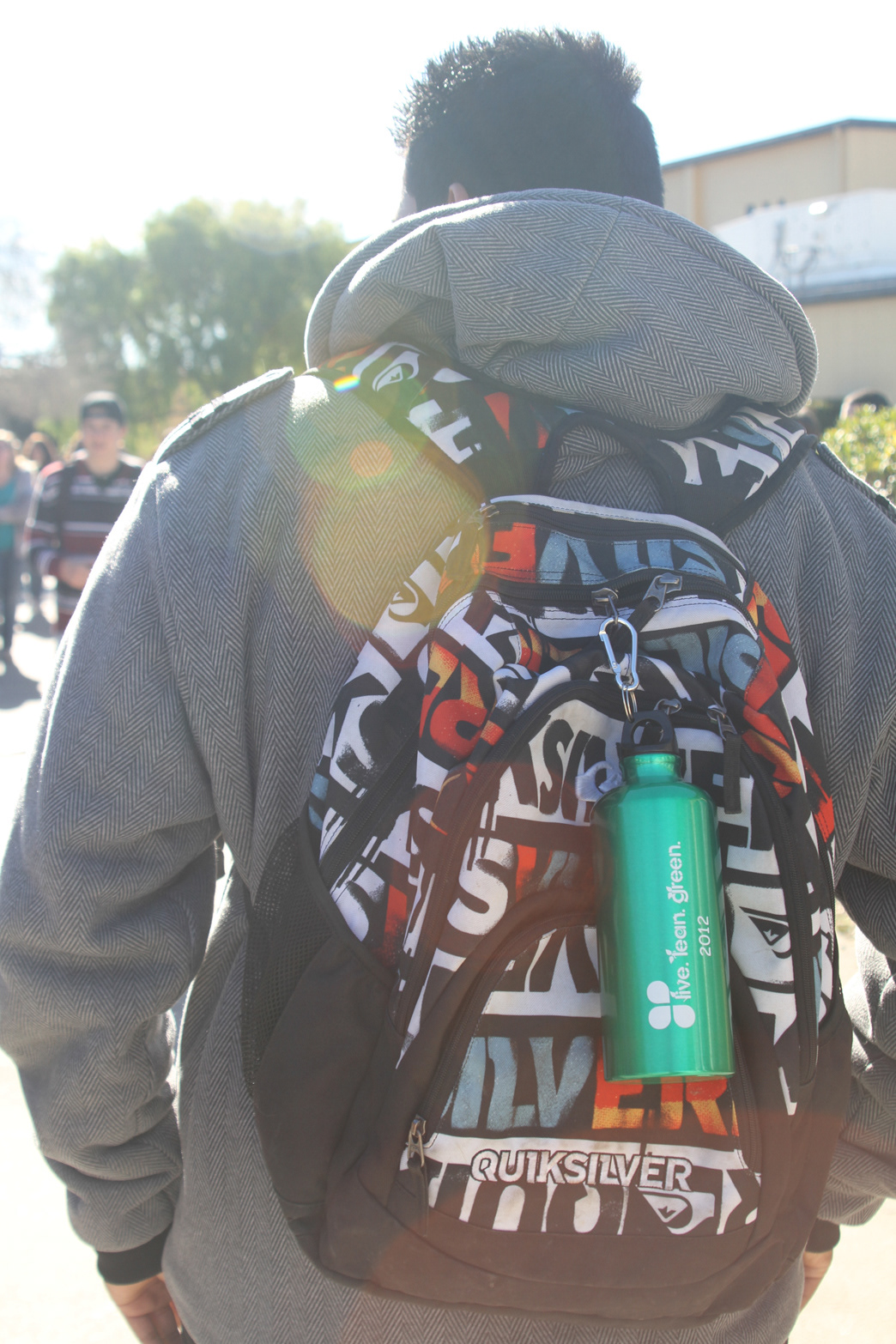
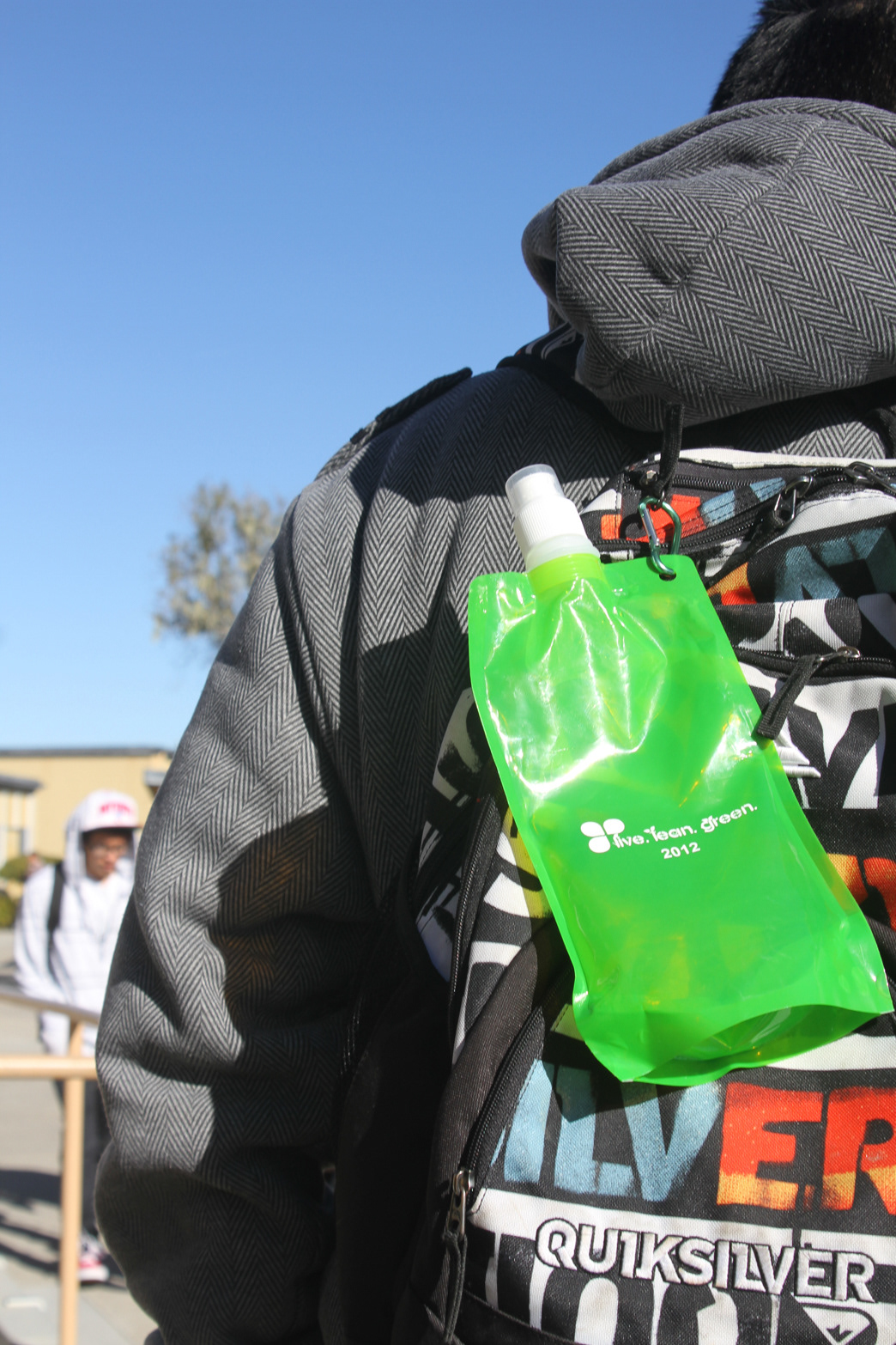
This logo is my first client driven project. It was for a youth program on base and they wanted me to represent the Vandenberg program. The guidelines were that it had to emphasize that it was all about eating healthy, being active, and eco-friendly. I thought that a rounded type with leaves protruding out of the letters would emphasize the eco-friendly. The color also emphasiszed eating healthy, along with being active. I then submitted the work and it was sent into the contest. About a month later, they replied and said that my logo was the best in the contest. What they didn’t tell me was that my logo was going against every military youth program AROUND THE WORLD!! I found out when my friend in Germany told me that she saw my logo. The Base Commander gave me an award for my logo, and they put my logo onto a set of items to give out. They put it on water bottles, metal and plastic; and tshirts. This project let me know the feeling of having work published and be truly professional.

Logo